Creating a pattern for ceramic frit printing on glass demands a combination of artistic vision, technical expertise, and strategic planning. With a wealth of talented artists worldwide, the search for designs that harmonize with glass as a medium is an ongoing pursuit. Once a pattern is chosen, the true craftsmanship unfolds, customizing it to optimize the interplay between light transmission and reflection, a distinctive quality that sets glass apart. This process requires careful evaluation of how the design will integrate with its environment, ensuring not only aesthetic appeal and functional integrity but also a lasting, timeless presence. Anticipating how the pattern will develop on the glass surface calls for a deep understanding of the printing process and the ability to envision the final outcome before execution. Through skillful refinement and precise adaptation, the pattern evolves into a seamless blend of art and technology, achieving structural architectural reliability. While the following considerations contribute to producing a high-quality print, they represent only a portion of the intricate process involved.
Choosing the right Glass
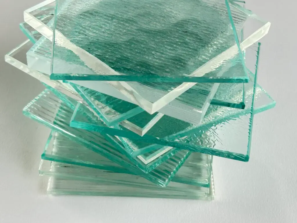
Most all glass is offered in both Clear (green tint) and Low Iron (crystal clear). Our standard glass is Low Iron. It’s true that Clear is less expensive but it doesn’t work for applications where color is important. Low Iron is Crystal Clear and therefore the best for decorative glass when color matching is critical to a successful project. Use our Model Numbers to clearly identify Glass Type.
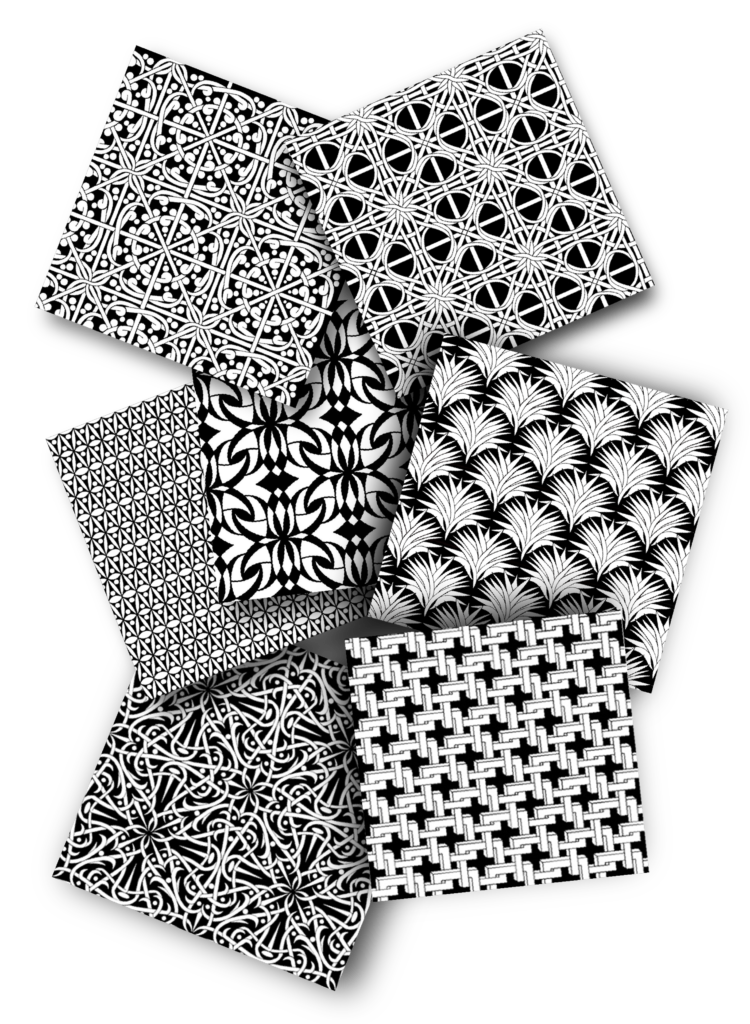
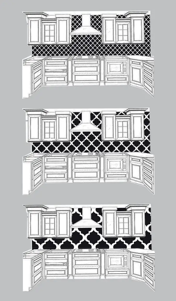
Choosing the right pattern or having one custom developed is the creative beginning. Once it’s decided upon, then all lines are trued, and a swatch is created in order to make a seamless pattern.
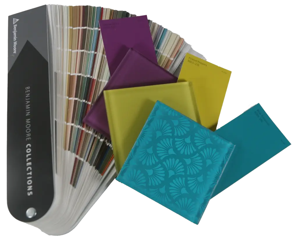
Custom colors are no problem. There are some limitations with the ceramic frit ink, but we’re happy to explore alternatives with you if your project calls for something outside of the color space. We match to Benjamin Moore, Sherwin Williams, Pantone and RAL
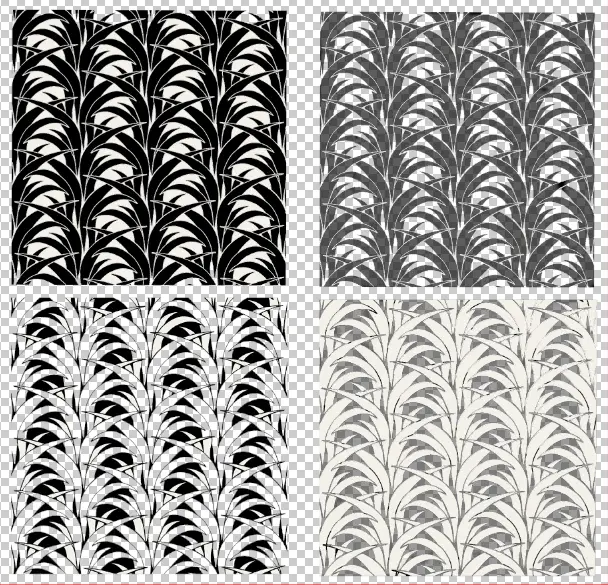
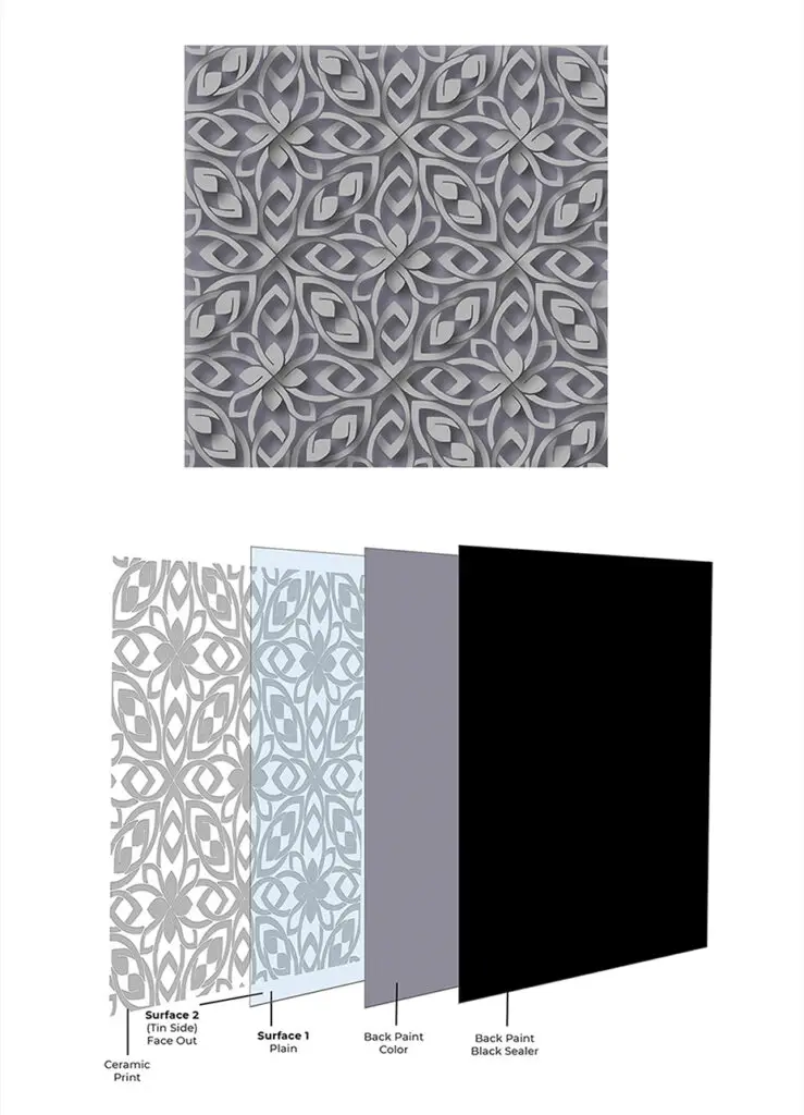
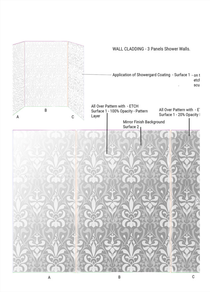
Combined with transparency. Deciding what parts of a pattern should be left totally transparent and what should be opaque are one of the most beautiful aspects of designing a great print. Mixing opacities can really add depth and texture to the pattern. The ink is opaque enough to cast it’s own shadow and when done properly will interact with ambient light resulting in movement. Deciding on Positive or Negative is also critical. Shown at left the checkerboard pattern indicates full transparency.
Choosing the right Scale
The scale of the print is a big consideration; we can go so small it will look almost like screen or really big for a large abstract look. We provide paper proofs so you can tack to the wall as part of the approval process.
Engineering the glass print also requires thinking through what surface you want the print to be on, this is especially important when mixing manufacturing processes. You get very different look from Surface 1 to Surface 2, if working on Laminated or Insulated would include Surfaces 3 & 4. We have pre-engineered products on the glass type page for easy reference by model number.
Tiling the Pattern
The printer is capable of drop on demand precision delivery of the ink and also prints edge-to-edge. This makes tiling of patterns possible, so even if a seam is required, we will match the pattern.